Monday 5 May 2014

Qvaint: Satan For The House Proud - Final Designs


Qvaint: Satan For The House Proud - Colour Palette

As my pieces are intended to be hand drawn onto crockery, i decided to keep the colour palette limited to just black, white and red. This means that all pieces in the collection will work as a set and are also not too complex to recreate, each time. The red is so that the cheeks of the goats stand out, but on the images where goats were not involved, I started to have a hard time working out what should be red and what shouldn't. 
My image of a burning church went through several changes before I settled on a final.


Qvaint: Satan For The House Proud - Goats

After experimenting with different satanic and occult symbols, I decided to look at goats. Goats were symbols of virility in ancient cultures and after the Christian takeover in the West old Pagan Gods were treated as blasphemous, and now they are thought of as Satanic creatures. 
The main reason for my decision to look at goats in particular in this project was that women tend to like animal motifs on products. Woodland animals, such as deer and foxes have been common in surface pattern design in recent years and I felt that goats could work well as the main focus for the imagery in this collection.

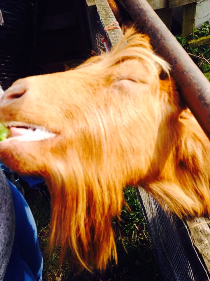
I began by visiting Heeley City Farm in Sheffield, to gather some primary research, take some photographs and make some sketches. Heeley is lucky in that it has several varieties of goat, including Bagot, Anglo Nubian, Guernsey and English Goats.

Above: Bagot Goat  (Rare breed originally introduced to England in the 1380s)


Above : Guernsey  goats

Above: Anglo Nubian


After some quick pencil sketches, I made a detailed fine liner sketch of one of the Bagot goats, as these were the breed I found to be the cutest, with their fluffy coats and long horns. 


I then went on to make sketches of other breeds of goats from sources I found online, to practice drawing the different types.
 Gradually I began to stylise the drawings, as I thought a stylised design would suit the collection better.
 Gradually they became simpler and more naive in style

 I also experimented with shape and pattern within the silhoutte of the goat's head. I liked the outcome of this piece, but I thought it would be too complex for a design intended for a small item.
 I then edited my Bagot goat sketch on Photoshop to experiment with placing a "satanic" creature against a feminine background. Again I decided that although it worked as a nice image, the design was much too complex for something that was intended for a small item such as a mug or a teapot. I also don't think the image was cutesy or humorous enough for it to create a tongue in cheek/any connection to the metal scene.


Finally I decided that my collection would incorporate a protagonist, partaking in different events related to Satanic or Black Metal culture. I made the decision to continue the naive style I had been  developing and create three character designs for my protagonist goat.
Although I enjoyed the crosshatching of the first character, I felt that it would be too difficult to re-create over and over to a high standard, when decorating each set. The middle character I felt looked more like a cat with a goat's head than anything else, but the final goat, which took after the Bagot goat, worked well. The simplicity and graphic design of the character makes it easy to reproduce over and over, but it still looks very much like a goat and its plump body allows it to appeal as a comical and adorable character.

Qvaint: Satan For The House Proud - Development


My FMP this year is to create a collection of crockery aimed at fans of Black and Doom Metal. As the majority of homeware tends to be directed towards a female demagraphic, I wanted my products to also appeal to the female sector of the Extreme Metal scene, which has grown signficantly in recent years. Added to the aformentioned target audience, I believe my products would also appeal to younger females involved in other counter cultures, as occult and Satanic imagery has been on trend for the past year or so, with clothing brands such as Killstar and Black Craft.

My initial sketches were of St Peter's cross and other symbols associated with Satan and found within Black Metal artwork and imagery. I filled them with cutesy patterns or crosshatching and experimented with different colours, which could give these "evil" symbols a feminine or approachable edge.

Wednesday 15 May 2013

2013 - Russian Elitist Doom Kitty

I bought a copy of "Dirty Russian", which is a phrasebook full of Russian slang and profanities. I came across the phrase "Posers really annoy me" and it tickled me so much I had to illustrate it. Here is Behemoth the Russian Elitist Doom Kitty :)

Sunday 5 May 2013

2013 - Huddersfield -Russian Animal Book Project


Above are the finals I created for my project. The outer leeve, inlay and four finished illustrations as examples of the content of the book.

I found this project challenging but definately the most enjoyable of the year. Although still very much my style, I've definately changed in how I draw to be more child friendly and I would certainly consider attempting another children's book project - especially an educational one like this, as this is the subject area that tends to be ignored by contemporary illustrators.

Saturday 4 May 2013

2013 - Huddersfield - Russian Animal Book Project


For the final project of the year I decided to create a book designed to teach young English children the names of animals in Russian, as I find educational books somewhat lacking in quality, for illustrations. My aim was to create a book that was simple to navigate, engaged both younger and older audience and drew heavily on Russian design mixed with my style.

Here is the inlay for the book and some page borders which I created by taking inspiration from patterns found in Russian folk art and textile design.